Let’s play a game. Close your eyes and think of:
- A checkmark.
- A half-eaten apple.
- A yellow “M”.
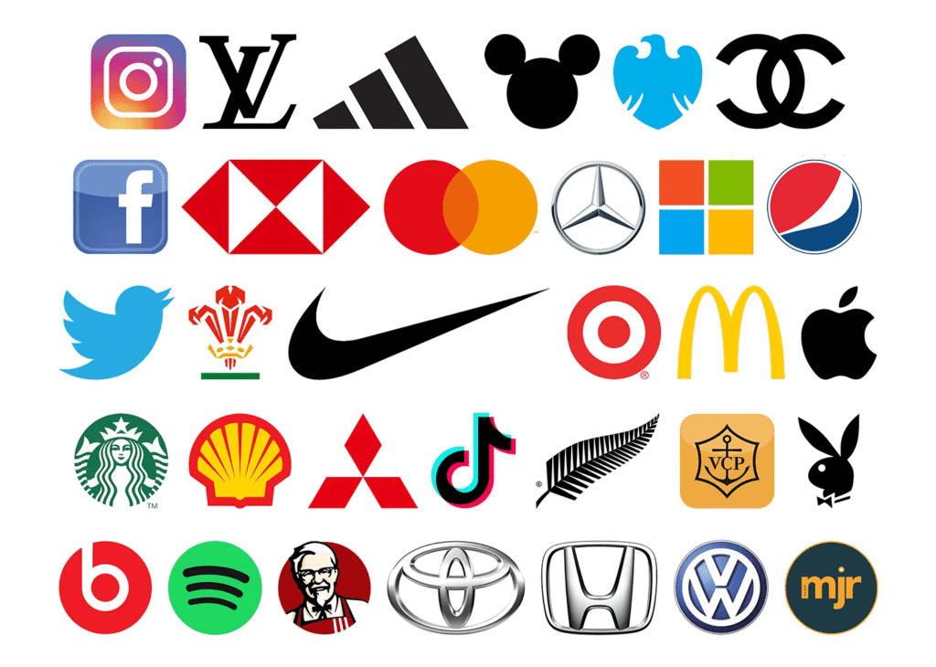
Chances are, you didn’t see abstract shapes. You saw Nike, Apple, and McDonald’s. That’s the insane power of a great logo. It’s not a drawing; it’s a psychological trigger.
Your logo is your brand’s handshake, its first date, its battle flag—all rolled into one. Get it right, and it works for you 24/7. Get it wrong, and it’s just… noise.
This isn’t a boring design lecture. This is your backstage pass to creating a logo that people actually remember. Let’s dive in.
A: The “It” Factor: What Makes a Logo Iconic?
Forget subjective opinions. The best logos all share a few non-negotiable traits. Think of this as your cheat sheet.
- SIMPLICITY IS KING: The golden rule. The Nike Swoosh is a checkmark. Apple is an apple. Complicated logos die on a mobile screen. Simple ones are unforgettable.
- MEMORABLE (DUH): It should stick in your brain after just a glance. If you need to explain it, it’s already failed.
- TIMELESS, NOT TRENDY: That cool “gradient mesh” or “2016 shadow effect” will look dated fast. The best logos avoid fads and could still be iconic in 50 years.
- VERSATILE AF: It must work everywhere. On a tiny app icon, a giant billboard, a black-and-white pen, and an embroidered hat. If it fails in one place, it’s broken.
- APPROPRIATE: A skull-and-crossbones logo might be great for a heavy metal band but a terrible choice for a daycare. The style must match your industry and vibe.
B: Logo Inspiration Gallery: Why These Icons Work
Let’s break down the legends. See the strategy behind the beauty.
| Logo | The Genius Move | Why It’s Brilliant |
| Nike | The Swoosh | It means motion and victory. So simple it’s often used without the name. Pure confidence. |
| FedEx | The Hidden Arrow | Look between the ‘E’ and ‘x’. See it? That arrow screams speed, precision, and forward movement. A secret win. |
| Amazon | The A-to-Z Smile | The arrow points from A to Z (we have everything) and forms a smile (customer satisfaction). Two messages in one. |
| Apple | The Bitten Fruit | It’s a play on “byte” (tech) and the fruit of knowledge (innovation). Clean, approachable, and deeply clever. |
C: Find Your Flavor: The 7 Logo Styles (Pick Your Fighter)
Not all logos are created equal. Which one fits your brand’s personality?
- The Emblem (Starbucks, Harley-Davidson)
- Vibe: Classic, prestigious, “established.”
- Good for: Breweries, schools, teams, anything with heritage.
- The Mascot (KFC, Kool-Aid Man)
- Vibe: Fun, friendly, family-oriented.
- Good for: Food brands, sports, products targeting kids.
- The Wordmark (Google, Coca-Cola)
- Vibe: Direct, clean, confident.
- Good for: Companies with a strong, unique name. Reinforces name recognition.
- The Lettermark (IBM, HBO)
- Vibe: Modern, sleek, corporate.
- Good for: Companies with long names (International Business Machines → IBM).
- The Pictorial Mark (Twitter, Apple)
- Vibe: Bold, iconic, symbolic.
- Good for: Global brands that have achieved ultimate recognition. The ultimate brand test.
- The Abstract Mark (Pepsi, Adidas)
- Vibe: Conceptual, modern, emotional.
- Good for: Conveying a feeling (like energy or unity) without a literal image.
- The Combination Mark (Burger King, Lacoste)
- Vibe: The best of both worlds, versatile.
- Good for: Almost everyone! This is the most common and flexible type, combining a symbol with text.
Part 4: Your No-BS Guide to Getting an Amazing Logo
Ready to create yours? Follow this action plan.
1: Do Your Homework
You can’t design a logo in a vacuum. Answer this:
- Who are you talking to? (e.g., Luxury moms vs. budget college students)
- What’s your personality? (e.g., Rugged and authentic vs. sleek and techy)
- What makes you different?
2: Sketch Like a Maniac
Grab a notebook. Doodle 50 ideas. Don’t censor yourself. Bad ideas lead to good ones. Think about symbols related to your name, your values, your mission.
3: Choose Colors & Fonts With INTENTION
This is not about your favorite color. It’s psychology.
- Blue = Trust, Security (Facebook, Banks)
- Red = Excitement, Hunger (Netflix, Coca-Cola)
- Green = Growth, Health (Whole Foods, Spotify)
- Fonts: Serif fonts (with little feet) feel traditional. Sans-serif fonts feel modern and clean. Script fonts feel elegant.
4: Get Smart Feedback
Don’t ask your mom if she “likes it.” Ask strangers:
- “What company do you think this is for?”
- “How does this logo make you feel?”
- “Is it memorable?”
Agency, Freelancer, or DIY? The Ultimate Showdown
| Graphic Design Agency | Freelance Designer | DIY Website Builder | |
| Price | 💰💰💰 (High) | 💰💰 (Medium) | 💰 (Very Low) |
| Best For | Full brand overhauls, big budgets | Quality + personal touch, SMBs | Hobbyists, placeholder logos |
| Pro | Full team, strategic, reliable | Direct contact, often more affordable | Fast, dirt cheap |
| Con | Expensive, can be impersonal | You have to vet them, one person | Generic, unoriginal, no strategy |
The Verdict: For most serious businesses, a skilled freelance graphic designer (found by searching “company logo design near me”) or a boutique graphic design agency is the best investment. You’re not paying for a picture; you’re paying for strategy.
Your Logo is a Promise. What’s yours?
A logo doesn’t build a brand—people do. But a great logo is the flag they rally under. It’s the symbol that comes to mean everything your company stands for: quality, fun, innovation, trust.Invest in it wisely. Make it simple, meaningful and unforgettable.
Now go forth and create something iconic. Fern Investbury